Meta Description: Learn how to use color psychology to lift your mood at home with simple, budget friendly ideas that blend chromotherapy and interior design for wellness.
Color Psychology at Home: Easy Mood Boosters You Can Try Today
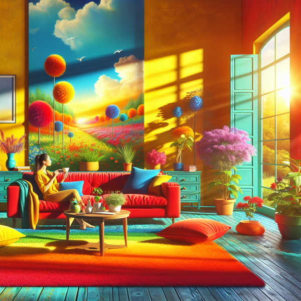
Imagine stepping into your living room and feeling calmer without doing a single breathwork exercise. That is the magic of color psychology. The link between mood and color is not woo or guesswork. It is backed by decades of research, and it has become a core of home decor wellness. With a few mindful tweaks, you can turn every room into a quiet motivator, a soft hug, or a morning jump start. In this guide, we will unpack how color shapes emotion, how chromotherapy inspired ideas can help, and how to pick shades that fit your taste and your daily life. By the end, you will have a simple plan for interior design for wellness that feels personal, doable, and fun.
Mood and color basics for interior design for wellness
Colors are like background music for your brain. You might not notice them after a few minutes, but they keep nudging how you feel and act. Warm hues often spark energy, while cool hues tend to soothe. Lightness, saturation, and context then fine tune the mood. That blend gives you a toolkit of mood boosters that you can dial up or down depending on the room and the time of day.
Here is the short version of why this matters. Your home is not a showroom. It is a daily environment that feeds your senses. Matching mood and color on purpose transforms routines. Breakfast in a soft yellow kitchen can make a gray morning feel lighter. A teal or sage bathroom can shift a fast shower into a mini spa. A focused blue home office can help you get into flow faster with less effort. That is home decor wellness at its simplest: align the space with how you want to feel.
There is also personal history. You bring your own color story. Maybe you hated green in school uniforms, or maybe your grandmother had a coral sofa that felt joyful. Your memories matter. Two people can look at the same shade and feel different things, and both are valid. So start with common patterns from color psychology, then filter everything through your taste, your light, your daily habits, and your culture.
Chromotherapy, sometimes called color therapy, has a long history in wellness. Old traditions used colored light and pigments to guide mood and even aid healing. Modern science looks at parts of this through the lens of perception and physiology. While you do not need special lamps or lab equipment, you can borrow the spirit of chromotherapy at home. Use color to prompt a state: awake, calm, cozy, or clear. Think of it as a gentle nudge, not a cure all.
One more key piece is light. Sunlight shifts from cool in the morning to warm in the evening. Bulbs do too. Cool white bulbs push crisp focus. Warm white bulbs invite rest. Before you pick paint or textiles, check your light at three times of day. The same blue can feel happy at noon and stormy at dusk. Small test swatches are your friend.
Chromotherapy inspired home decor wellness you can apply now
Let us break color down into a few practical levers. This makes decisions easier and results more reliable. The goal is not a perfect palette from a catalog. The goal is rooms that support you, and color is a fast and affordable mood booster.
Specific aspect 1: Warm and cool families in action
Warm colors sit on the red to yellow side of the wheel. They tend to feel lively, social, and cozy. Cool colors sit on the blue to green side. They lean calm, clear, and relaxing. Here is how to use that split without getting stuck in rules.
- Living room energy: Try a muted terracotta throw, a pair of ochre cushions, or a rust velvet chair. Warm accents make a neutral sofa feel inviting without shouting. If you host a lot, warm notes can spark conversation and add a sense of togetherness.
- Bedroom calm: Gentled cools like misty blue, eucalyptus green, or soft lavender dial down noise. Think duvet covers, curtains, or a headboard in a cool textile. These help slow your heart rate in the evening and support deeper rest.
- Kitchen pep: Soft buttery yellow, coral napkins, or a painted stool can add morning spark. Warm hues here act like sunlight when clouds roll in. If you do not want yellow walls, try warm under cabinet lighting or a cheerful runner.
- Office focus: Clear blue and mid greens support mental clarity. A denim blue accent wall behind your desk or a sage built in can quietly reduce visual clutter. If you are on video calls, these hues also flatter skin tones under most lights.
Real world note: A friend swapped a pure white home office for a gentle slate blue. Meetings felt calmer, and task switching got easier. The wall color did not do the work alone, but it set the tone. That is the kind of small shift that pays off every day.
Specific aspect 2: Saturation, brightness, and balance
Not all reds shout and not all blues whisper. Saturation and brightness change the story. High saturation colors are vivid and punchy. Low saturation reads as muted and subtle. Brightness measures how light or dark a shade looks. These sliders help you regulate the volume of a room.
- High saturation = high energy: A vivid coral vase or canary art print can wake up a space. Use small, movable pieces to avoid overload.
- Low saturation = soft comfort: Dusty rose, greige, and misty green live in this range. They are easy on the eyes and blend well with natural textures. Great for bedrooms and reading nooks.
- Bright and light = airy: Pastels make small rooms feel bigger. They bounce light around and keep things fresh.
- Deep and dark = cocoon: Navy, forest, and charcoal wrap a room in warmth. Balanced with warm metals and soft fabrics, they feel luxe, not heavy.
Action steps if you are not sure where to start:
1. Pick the feeling first. Do you want to feel calm, focused, cozy, or energized in this room? Write one word on a sticky note.
2. Pull 5 swatches that support that feeling. Include a light, a medium, and a darker option. Include one warm and one cool for contrast.
3. Tape each swatch to a wall near a window and an interior corner. Look at them morning, afternoon, and night. Take quick photos each time.
4. Remove the two that feel wrong on any pass. Usually you will land on a clear favorite by day three.
This swatch dance might sound fussy, but it saves money and regret. You will feel how mood and color shift with light and texture in your actual space. That is the heart of interior design for wellness: test, feel, refine.
Specific aspect 3: Placement, proportion, and common mistakes
Color works hardest when you control how much and where. A classic ratio to aim for is 60 30 10. Sixty percent base, thirty percent secondary, ten percent accent. You do not need a measuring tape. Just keep the idea in mind as you layer.
- Base color: Usually the wall and large rug. Keep it grounded and gentle.
- Secondary color: Sofa, curtains, big bookcase, or bedding. Give it more personality.
- Accent color: Lamps, cushions, art, flowers. This is your spark and your seasonal swap.
Common mistakes and how to dodge them:
- Going all in on one strong color: A full red room can feel tense. Balance heat with soft neutrals or cool counterpoints, like a natural linen sofa with terracotta pillows and a pale sage plant pot.
- Ignoring undertones: Grays can skew blue, green, or purple. Beiges can skew pink or yellow. Compare swatches side by side. The odd undertone will jump out.
- Forgetting texture: Matte paint absorbs light and looks softer. Gloss bounces light and reads brighter. Woven fabrics mute color. Velvet intensifies it. If a shade feels off, change the finish before you change the hue.
- Neglecting lighting temperature: Warm bulbs make beige cozier and can make crisp blue look muddy. Cool bulbs make blue fresh and can make warm beige go flat. Match bulb temperature to your palette.
- Leaving art for last: Art can anchor a palette. Choose one piece you love and pull two colors from it. Build around those. It is a fast route to harmony.
Professional wisdom often points to layered neutrals as a calm base, then targeted color for mood boosters. Even bold lovers benefit from one grounded anchor. This is not about fear of color. It is about rhythm. Quiet, then a beat. Quiet, then a beat. Your eye needs places to rest so it can enjoy the pops.
Room by room ideas you can try this weekend
Entryway reset zone:
- Goal: Transition from outside to inside with ease.
- Colors: Sage, dusty blue, or warm greige.
- Quick wins: Paint the inside of your front door. Add a small runner with a gentle pattern. Use a woven basket in natural tones for keys and mail. These create a calm landing, a small act of home decor wellness that sets your mood as you step in.
Living room social battery:
- Goal: Invite connection without visual noise.
- Colors: Soft clay, muted teal, or a creamy white with warm undertones.
- Quick wins: Layer a clay throw on a neutral sofa. Swap cool white bulbs for warm white. Add a deep green plant to bring cool balance to warm textiles. Mix a wood coffee table with a teal tray for a tidy focal point.
Bedroom rest and recharge:
- Goal: Help your nervous system switch off.
- Colors: Mist blue, eucalyptus, pale mauve, or mushroom.
- Quick wins: Choose bedding in a cool, low saturation tone. Paint only the wall behind the bed for a soft cocoon. Keep accents quiet. One small brass lamp adds warmth without glare. Blackout curtains in a calming shade are a practical mood booster.
Home office focus and flow:
- Goal: Clear head, steady energy.
- Colors: Slate blue, sage, or a soft mineral gray.
- Quick wins: Paint a single focus wall behind the desk. Use a desk mat or mouse pad in your chosen hue to reinforce the mood. If you need more pep in afternoons, add a coral or mustard pencil cup as a tiny energy cue.
Kitchen bright and cheerful:
- Goal: Encourage cooking and connect over meals.
- Colors: Buttery yellow, mint, soft white with warm undertones.
- Quick wins: Try open shelf accents in mint and white ceramics. A striped runner in warm white and honey makes mornings feel sunny. If you rent, try peel and stick backsplash tiles in a light, happy tone.
Bathroom spa effect:
- Goal: Calm mornings, take it easy nights.
- Colors: Sea glass, pale aqua, warm white, light stone.
- Quick wins: Choose towels in a sea glass family. Swap harsh cool bulbs for warm dimmable ones. Add a light wood stool. A single green plant like pothos softens corners and adds a refreshing cool note.
Kids room playful balance:
- Goal: Fun by day, sleep by night.
- Colors: Softened warm brights like peach and sky, anchored with creamy white.
- Quick wins: Keep walls light. Use color in bedding and art that you can rotate. Add a dim lamp with a warm bulb to help wind down.
Guest room welcome:
- Goal: Cozy and neutral with a touch of character.
- Colors: Warm gray, linen, a hint of sage or blush.
- Quick wins: A linen duvet, a woven throw, and a small vase with seasonal greenery. Simple, calm, and friendly to many tastes.
Budget friendly ways to add mood boosters without paint
- Textiles do the heavy lifting: Throws, cushion covers, and curtains change a room fast. Choose one hero color and echo it twice in small ways.
- Art as a palette anchor: Pull two colors from one piece you love. Repeat them in books, ceramics, or frames.
- Lamps and shades matter: A warm shade on a lamp turns a cool corner cozy. A colorful lamp base adds a subtle pop without taking over.
- Rugs set the ground: A rug with a soothing base color steadies a busy room. A rug with warm accents energizes a cool space.
- Functional color cues: Water bottles in aqua remind you to hydrate. A citrus toned fruit bowl nudges you to grab a snack. Small chromotherapy inspired cues can shape habits through color prompts.
- Plants count as color: Green is a natural calm. Planters add another shade. Clay, sage, white, or charcoal pots reinforce your palette with little cost.
Lighting, scent, and texture that support your palette
Color does not live alone. It plays with light, scent, and texture. Get these allies on your side.
- Bulb temperature: Use warm bulbs in rest zones, and neutral to cool bulbs in work zones. Check 2700K for cozy, 3000K to 3500K for balanced, 4000K to 5000K for crisp task light.
- Dimmers are gold: The same color can serve movie night and morning chores if you can shift light levels.
- Scent pairing: Citrus feels bright with yellow accents. Eucalyptus or mint pairs well with cool blues and greens for a spa vibe. Vanilla and cedar balance deep blues and charcoals.
- Texture harmony: Rough textures mute color and add calm. Smooth and shiny finishes increase color intensity. Balance them based on how stimulating you want the room to feel.
How to build a simple mood plan for your home
1. List your rooms and the main feeling you want in each. Keep it to one word per room: calm, focus, cozy, joy, or clarity.
2. For each room, pick a base family (warm or cool), then a saturation level (muted or vivid), then a brightness (light or deep). Write it down.
3. Choose a single accent color per room that supports the goal. Use it at 10 percent in small pieces that you can swap by season.
4. Test with small items before paint. Try a cushion, a throw, or paper swatches pinned to the wall.
5. Decide on bulb temperatures based on the room goal. Set the vibe with light before you spend on gallons of paint.
6. Layer slowly. Bring in texture next, then art, then plants. Step back after each layer and check how you feel.
7. Adjust with the seasons. Warm up in winter with ochre and rust accents. Cool down in summer with sea glass and pale linen. Your mood plan can flex without a full redo.
Frequently asked quick answers
- Is there a universal happiest color? Not exactly. Many people find yellow uplifting and blue calming, but culture, light, and personal history matter. Test in your space.
- Will gray make my home sad? Not if you treat undertones and contrast with care. Warm gray with wood and plants feels calm, not cold. Layer texture to avoid flatness.
- Can I mix warm and cool in one room? Yes. In fact, a little contrast makes a room feel alive. Try a warm base with cool accents or the reverse.
- Do I need chromotherapy lights? No. Natural light and thoughtful paint, textiles, and art do plenty. If colored light intrigues you, try it in a small way, like a soft pink salt lamp for evening wind down.
- What if I rent and cannot paint? Focus on textiles, art, peel and stick, and lamp shades. You can create strong mood and color shifts without touching the walls.
Common color pairings that rarely fail
- Calm bedroom: Mist blue walls, linen bedding, warm white lamps, eucalyptus plant.
- Elevated living room: Warm gray sofa, clay pillows, sage throw, brass lamp, charcoal rug.
- Cheerful kitchen: Creamy white cabinets, mint runner, honey wood stools, citrus bowl.
- Focused office: Slate blue accent wall, light oak desk, black task lamp, small coral tray for energy.
Small daily rituals that reinforce your palette
- Morning light sweep: Open blinds to let your chosen colors wake up. Cool blues pop in morning light. Warm neutrals glow at dusk.
- Reset at lunch: Five minute tidy in a basket that echoes your accent color. Quick reset, instant mood boost.
- Evening dim down: Switch to warm lamps to let cool colors soften and invite rest.
- Seasonal swap box: Keep a small box of accent items by season. Summer sea glass greens, autumn ochre and rust, winter deep navy and berry, spring blush and mint.
Conclusion: turn your home into a steady mood booster
Color is not just about pretty. It is about how you feel from the moment you cross the threshold. When you work with color psychology, you harness a quiet force that guides energy, comfort, and focus. Mood and color go hand in hand, and small shifts can tip your day toward better. You do not need a big budget or a full renovation. A few swatches, mindful lighting, and the right accents build an interior design for wellness that fits your life.
Start small. Pick one room, set one feeling, and try one change. Swap a lamp shade, throw a new cushion on the sofa, or paint a single wall. Notice what changes in your mood. When you find what works, repeat it in other rooms. With a bit of play and the spirit of chromotherapy, your home becomes a set of daily mood boosters that you can lean on, season after season.


